Two summers ago I closed my windows at four in the afternoon, because four in the afternoon was when I could finally smell it. The Canada wildfires smoke map had been open on my laptop since breakfast, and it had put that plume over my street at one o'clock. I just hadn't learned to read the bar along the bottom of the screen.
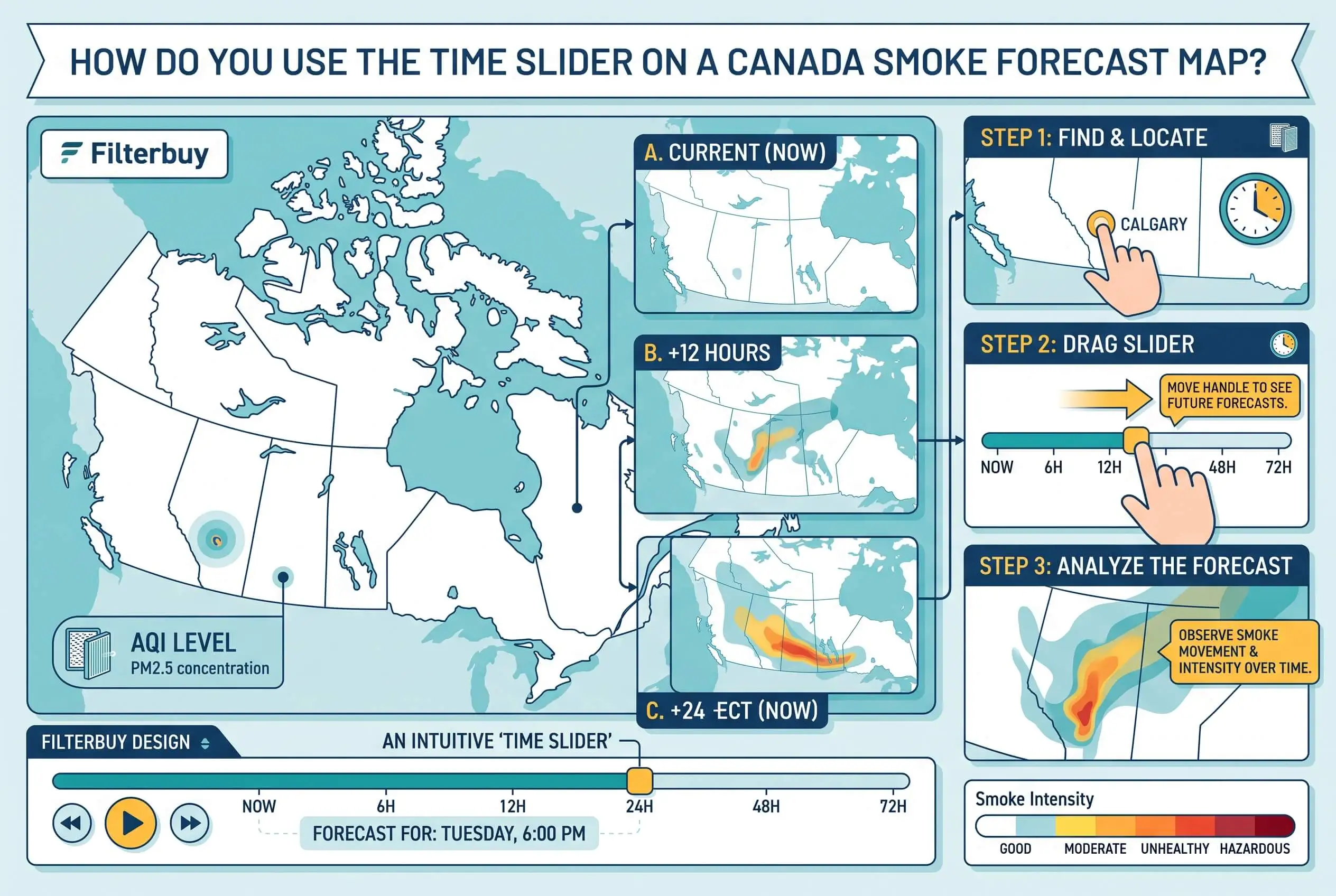
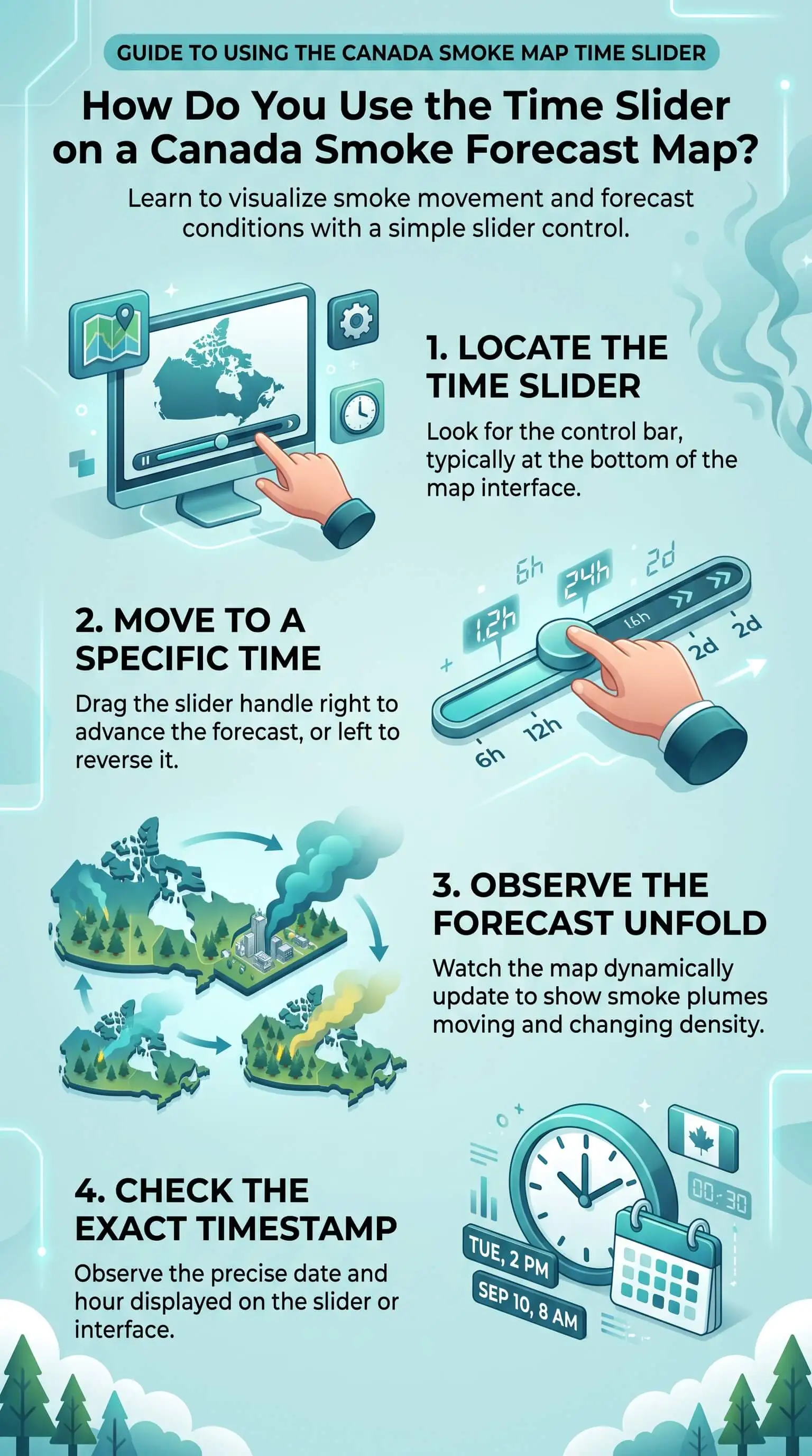
That bar is the time slider. Every step you drag it pushes the forecast ahead by one hour, and the label beside it tells you which hour you're looking at. Those two facts are the whole trick. Once you have them, a smoke map stops being a picture of something happening to you and starts being a schedule you can work from, which is a much better position to be in when the air outside your house is about to change and nobody can see it yet, especially when you pair that forecast with indoor air quality testing to understand what is happening inside your home.
TL;DR Quick Answers
canada wildfires smoke map
A canada wildfires smoke map shows modelled or satellite-observed smoke, not the air you are breathing. Read the forecast for timing, then check monitor readings for current conditions. Confirm whether the timeline runs on your local time or UTC before you plan around any hour it gives you.
Forecasts predict, monitors measure. Use a forecast to find the hour smoke arrives over your address, and monitor readings to see what is actually in the air right now.
Check the time base first. Canadian smoke forecasts run on UTC but display your device's local time by default, and the toggle is the date text inside the animation control.
Clean air on the map can still mean fire. Satellites pass over a given area roughly once a day, so anything igniting after that pass waits for the next cycle before it appears.
Column smoke is not ground smoke. Vertically integrated products cover the whole air column and look alarming while near-surface readings stay acceptable.
Top Takeaways
One step equals one hour, and that hour is an average. You're not looking at an instant, and you're not looking at a photograph.
Confirm the time base before anything else. The model runs on UTC while the map defaults to your device's local time. Clicking the date inside the animation control switches between them.
Expect a one-hour label gap between the map and the raw data. The map stamps its images at the start of the hour. The model file stamps its output at the end of the same one.
Clean air on the map can mean an undetected fire. Satellites pass over a given area about once a day, so anything starting or growing after the pass waits for the next cycle.
Check the domain and the smoke type. Regional grids ignore outside sources, and column smoke looks far worse on screen than near-surface smoke.
Turn the arrival hour into tasks. Close up and recirculate ahead of it, have filter media staged before it, and swap the loaded media out once your clear hour arrives.
What the Time Slider Is Actually Showing You
Each frame is a model's best guess at fine particle concentration down where you breathe, reported in micrograms of PM2.5 per cubic meter. Not a satellite photograph of what's overhead. Not a health score.
And each frame covers a whole hour, averaged, rather than freezing one moment. Most public smoke forecasts carry that hourly step out about two days. Two days at hourly resolution is exactly enough to plan around, which is why the slider is worth learning at all.
The Clock Question, and a One-Hour Labelling Quirk
Here's where I see people go wrong most often. The BlueSky Canada model runs on UTC, but the map you're looking at defaults to whatever local time your own device is set to. Click the date and time inside the animation control and it flips to UTC. During the Canadian fire season, April through October, that forecast publishes four times a day on a six-hour cycle at 15:00, 18:00, 00:00 and 06:00 UTC, and the 15:00 run is reliably the slowest of the four because it waits on a high resolution weather forecast before it can go. All of that sits in the BlueSky Canada FAQ, and I'd read it once before trusting any hour the map gives you.
There's a labelling quirk waiting for anyone who downloads the underlying data, too. The images on the web map carry the timestamp for the start of the hour they cover. The downloadable model file carries the timestamp for the end of that same hour. Same number, same hourly average, two different labels. If you line them up and find a one-hour gap, nothing is broken and you haven't misread anything.
A different clock governs the satellite fire and smoke analysis feeding many of these maps. NOAA stamps that product in UTC on a Julian day calendar, so North American readers subtract five to eight hours depending on the time zone, or four to seven while daylight saving is running.
How I Scrub the Timeline to Find an Arrival Window
Find your own address first. Set the map where you want it before you touch the time control, or you'll lose your place halfway through the hours.
Pull the slider back to the first frame and read the label. Check whether you're seeing local time or UTC before you go any further.
Step forward an hour at a time. The first frame where colour reaches your point is your arrival hour.
Keep stepping. Mark the hour the colour sits darkest over you, then the first hour it eases off.
Write those hours down. Arrival, peak, clear. Three numbers, and that's the entire useful output of the exercise.
Come back after the next run. An afternoon wind shift or a front moving through can slide an arrival hour by several hours between one run and the next, and I've watched it happen inside a single evening.
Why a Canada Wildfires Smoke Map Can Show Clean Air Over a Smoky Address
Two things cause this. Neither one means the map is broken, and knowing which one you're looking at saves you a lot of second-guessing.
First, satellite timing. The satellites that place fires in the model pass over any given area roughly once a day. A fire that ignites after that pass, or one that blows up unexpectedly after it, waits for the next cycle before it enters the forecast at all. Thick clouds do the same job by hiding the heat signature the satellite is hunting for.
Second, altitude. Some products draw smoke through the entire vertical column above you, which looks frightening on screen while the air at your front step is perfectly fine. Others draw near-surface smoke only, and that's the number your lungs care about. Check the label before you cancel anything.
It's also worth saying plainly that these are research products. The teams who build them call them experimental, and I take them at their word on that.
Check the Domain Before You Trust the Timeline
A regional forecast won't pull in smoke that started outside its own boundary. So a clean regional timeline sometimes just means the source fire is sitting off the edge of the grid, which is not the same thing as good news. Canada ranks second in the world by total area, with land running from roughly 52 degrees to 141 degrees west longitude. Any regional window covers a thin slice of the country that can actually send you smoke.
My habit now is to load the country-wide domain first and look for long-range transport, then zoom into the regional view once I know what I'm hunting for.
Cross-Check the Forecast Against What Is Burning Right Now
A forecast timeline tells you what a model expects. It says nothing about what anyone has observed. Before I act on an arrival hour I open a live Canada wildfires smoke map and look at current fire perimeters, new starts from the past 24 hours, and observed smoke coverage. When the observed picture and the modelled timeline disagree badly, I go with the observation for right now and the model for later today.
Canada's health index is a third instrument entirely, and it moves on its own clock. Those bulletins publish twice a day, at 6:00 a.m. and 5:00 p.m. local time, and they only get amended when the value swings two or more points and looks likely to hold there four hours or longer. A slider stepping hour by hour will move long before that bulletin does, so don't wait on the index to confirm what the forecast already told you.
Turning an Arrival Hour Into an Envelope and Filter Schedule
This is the part that made all the reading worthwhile for me. An arrival hour isn't information. It's a to-do list with a deadline on it.
Two hours ahead of that hour, close the windows, shut the outside-air intake, switch the system to recirculate, and move the fan from auto to on so indoor air keeps cycling through the filter instead of only moving when the thermostat asks for cooling.
How long that holds depends almost entirely on the building itself. A well-sealed, properly insulated house keeps the cleaner air you just bought. A leaky one keeps drawing smoke in through attic bypasses, recessed light housings, rim joists and open duct seams, no matter what setting the thermostat is on. That gap between the two houses is invisible until a smoke event puts a number on it. If you've been putting off air sealing, a forecast showing three smoky days ahead is a fair argument for booking it before next season rather than during one.
Have replacement filter media in the house before the arrival hour, not after. Media loaded with smoke restricts airflow, and running a starved system for days becomes its own problem on top of the first one. Keeping fresh pleated furnace filters ready helps maintain better airflow through the system during smoky conditions. When your clear hour comes, swap the loaded filter out, then open the place up and air it.
Finding the Controls on a Phone
On a small screen the site shrinks the animation controls and folds the information sidebar into a drawer, which is why plenty of people never find the slider at all and assume the map only shows right now. Look along the bottom edge for a narrow bar with a play arrow. Tapping the date and time text itself is what switches you between local time and UTC, giving you better timing for AC ionizer installation before smoke conditions worsen.
Terms Worth Knowing
PM2.5. Fine inhalable particles 2.5 micrometers and smaller, the fraction of smoke that travels deep into lung tissue.
Hourly average. One frame of the forecast, averaged across a full hour instead of a single instant.
Forecast domain. The geographic grid a model covers. Smoke born outside the grid never enters it.
Hotspot detection. A satellite-identified heat signature the model uses to place a fire.
Near-surface smoke. Concentration close to the ground, which is the reading that matters for breathing.
Vertically integrated smoke. Every bit of smoke in the air column above a point. Useful for haze and aviation, misleading for health.
UTC. Coordinated Universal Time, the reference clock these models run on.
AQHI. Canada's Air Quality Health Index, a 1 to 10 plus health risk rating rather than a concentration measurement.
Recirculate. The HVAC setting that stops pulling outdoor air and cycles indoor air through your filter instead.
“Timing is the part almost nobody uses well. I watched one homeowner close up two hours ahead of the arrival hour on her forecast, and her indoor particle readings never once caught up to what was happening outside during a four-day event. Her neighbour waited until he could smell it. He spent the rest of that week pulling his levels back down, because once fine particles are in a house you're filtering them out slowly instead of keeping them out cheaply.”
7 Essential Resources
See What the Instruments Are Actually Measuring Right Now
The AirNow Fire and Smoke Map, built jointly by the Environmental Protection Agency and the US Forest Service, reports fine particle readings from regulatory monitors, temporary monitors and low-cost sensors. Treat it as the observed counterweight to any modelled forecast, especially near the border.
Get the Indoor Playbook Before Smoke Season Opens
The EPA's Learn About Wildfires and Indoor Air Quality hub covers cutting smoke indoors, setting up a cleaner air room, and preparing schools and workplaces. Read it in March. Nobody reads it well in July.
Understand How NOAA Builds the Fire and Smoke Analysis Behind the Map
NOAA's Hazard Mapping System Fire and Smoke Product documents which satellites feed the analysis, how analysts sort smoke into light, medium and heavy, when each daily classification publishes, and where the known detection limits sit. Its own FAQ gives the clearest account I've found of why fire points shift position and why some fires get missed.
Know Which Symptoms Mean Slow Down and Which Mean Call Someone
The CDC page on how wildfire smoke affects your body lists the immediate effects worth watching and names who carry higher risk, including people with asthma, COPD, heart disease, diabetes and chronic kidney disease, anyone pregnant, and children.
Read the Engineering Guidance Behind Sealing and Filtration
ASHRAE's Wildfire Response Resources page gathers the society's work on protecting occupants from smoke, including Guideline 44-2024 and a free public policy brief. It makes the point I keep coming back to, which is that tighter, more energy-efficient buildings behave differently during a smoke event than older leaky ones do.
Catch Up on What Researchers Have Learned About Exposure
The National Institutes of Health published Watch Out for Wildfire Smoke in July 2026. It summarizes current research on short and long-term effects, lists the protective steps with the strongest evidence behind them, and cites its studies. Written for general readers, which is rarer than it should be.
Learn When Canada's Health Index Publishes and When It Gets Revised
Environment and Climate Change Canada's Guide to Air Quality Health Index forecasts spells out the twice-daily bulletin schedule, the periods each bulletin covers, and the exact conditions that trigger an amendment. Read it once and you'll stop expecting the index to chase a smoke plume hour by hour.
These seven resources help you compare live smoke measurements with forecasts, understand health risks, prepare indoor filtration, and use HVAC system repair to keep airflow and filtration working properly during wildfire smoke events.
3 Supporting Statistics
About 5 percent fewer fire pixels. NOAA retired manual verification of automated fire detections in its Hazard Mapping System effective April 15, 2026. The agency expects total fire pixel counts to fall by roughly 5 percent, with omissions showing up most in low-intensity fires and fires hidden under cloud or smoke. Analysts no longer filter false alarms by hand, and those have usually stayed below 1 percent. Source: NOAA NESDIS.
More than 8,000 fires and 2.1 million hectares a year. That's Canada's annual average. Lightning starts roughly half those fires and accounts for nearly 85 percent of the total area burned, which explains how a remote, unstaffed country ends up producing the smoke that arrives over a city. Source: Natural Resources Canada.
A column about 16 miles deep. NOAA's smoke models publish two separate products. Near-surface smoke covers the air close to the ground. Vertically integrated smoke covers the whole column from the surface to roughly 16 miles up, and that second product is the one turning a sky milky white while ground-level air stays acceptable. Source: NOAA Global Systems Laboratory.
Canada’s wildfire smoke can come from remote fires, travel through a deep atmospheric column, and differ sharply between what satellites detect and what reaches ground level, making smoke forecasts and MERV 8 pleated HVAC furnace air filters useful parts of preparing for changing indoor air conditions.
Final Thoughts and Opinion
After several seasons of this, my view is that most people ask the timeline the wrong question. They want to know how bad it's going to get. The slider is poor at answering that, and the modellers say so themselves.
What it does well is order your day. When does it arrive, when does it peak, when does it clear. Every household decision follows from those hours, and treated that way the map earns its keep. Treated as a precision concentration forecast it will let you down, you'll decide it was never accurate, and you'll stop checking it right around the time you need it most.
The fair objection is that you should skip forecasts and watch monitors instead, since a measurement beats a model. I agree monitors are the better source for what's happening this minute. They just can't tell me to close the house at two o'clock this afternoon, and that's the decision actually sitting in front of me, along with having high quality air filters ready before the smoke arrives.
Frequently Asked Questions
Is the smoke forecast the same as the air quality index?
No. A smoke forecast models one pollutant, fine particulate from wildfires, and hands you a concentration. Canada's health index blends fine particulate with ground-level ozone and nitrogen dioxide into a single health risk number. High PM2.5 usually means a high index reading, but you can't compare the two directly.
How often does the forecast update?
Four times a day during the April through October fire season, on a six-hour cycle. Runs slip when a lot of fires are burning or when input data arrives late, and the 15:00 UTC run is routinely the slowest because it waits on a high resolution weather forecast before it can start.
Why did the arrival time change between this morning and tonight?
A new model run replaced the old one, using fresher satellite fire positions and a fresher weather forecast. Wind shifts, fronts and afternoon convection all move plumes around, and each run reflects the latest picture. Treat an arrival hour as a moving estimate rather than a reservation.
Does the slider show smoke at ground level or up in the atmosphere?
Depends which product you've got open. Near-surface smoke describes the air you're breathing. Vertically integrated smoke describes the whole column overhead and can look severe while surface air is fine. Check the product label before you call off a soccer game.
Can I look at a smoke forecast for one specific location over time?
Not as a time series inside the map. The BlueSky Canada team notes it doesn't currently offer per-location time series data through the forecast viewer, though the raw model output is downloadable for anyone who wants to build their own comparison against monitor readings.
What should I do in the hour before smoke is forecast to arrive?
Close windows and doors, shut the outside-air intake, set the system to recirculate, and move the fan from auto to on so indoor air passes the filter continuously. Confirm there's a spare filter in the house. Then check a current-conditions map and see whether the forecast still matches what anyone is observing.
How far can wildfire smoke travel from the fire?
Hundreds of miles routinely, and further during large events. Researchers at the National Institutes of Health describe smoke turning up hundreds of miles from a fire, and NOAA builds its models to track plumes across the continent. You can sit well downwind of every active fire and still have a smoke problem in your living room.
Read Tomorrow's Arrival Hour Before You Decide When to Close the House
Pull up a forecast, step the slider to the first hour colour touches your address, and write that hour somewhere you'll actually see it. Every other choice you make about smoke, including when to arrange air ionizer installation services, gets easier once you know when it shows up.
